Typography is the heartbeat of great design—master its basics in 2025 to kickstart your creative journey! In 2025, typography basics for designers 2025 form the cornerstone of captivating, readable designs, essential for beginners at royalgraphix.co.ke. It’s the art of arranging type to convey messages and enhance visual appeal, whether you’re crafting logos, websites, or posters. This skill transforms text into a powerful tool, shaping how audiences connect with your work in an evolving design landscape. This guide introduces foundational skills to build your typography expertise, setting you up for success as the industry embraces new trends and technologies. Deepen your learning with the pillar post “Mastering Typography for Graphic Designers in 2025: The Complete Guide” at royalgraphix.co.ke. Ready to lay the groundwork for a thriving design career? Let’s dive into the essentials that will define your growth in 2025!
Section 1: Font Types
Grasping font types is the first step in typography basics for designers 2025, laying the groundwork for creating visually appealing and effective designs. Understanding these categories empowers beginners at royalgraphix.co.ke to make informed choices that enhance their projects.
Details: Start with serif fonts, like Garamond, known for their classic, decorative strokes that add elegance to print materials such as books or formal invitations. Sans-serif fonts, such as Open Sans, offer a modern, clean appearance, making them ideal for digital screens, websites, and 2025’s minimalist trends. Script fonts, like Pacifico, mimic handwriting with a playful or sophisticated flair, perfect for branding elements like wedding invitations or logos. Each type serves a unique purpose—serifs for tradition, sans-serifs for clarity, and scripts for personality—allowing designers to match typography to their creative vision.
The choice of font type can transform a design’s mood and readability. For example, a serif font might convey authority in a resume, while a sans-serif ensures legibility on a mobile app. Script fonts, when used sparingly, can add a personal touch to a brand identity. In 2025, mastering this variety is key to adapting to diverse design demands.
Tip: Analyze font usage in magazines or apps to identify their impact. Next time you flip through a publication or browse a website, note how serif, sans-serif, or script fonts guide your attention. This practice sharpens your eye and builds confidence for applying these basics in your own work at royalgraphix.co.ke.
Section 2: Hierarchy Principles
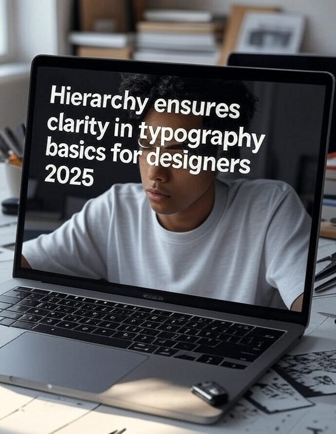
Hierarchy ensures clarity in typography basics for designers 2025, guiding viewers through a design with purpose and ease. For royalgraphix.co.ke learners, mastering this principle is essential to create organized, professional layouts that stand out in 2025’s competitive design scene.
Details: Start with size to distinguish elements—use larger text for headings to draw attention, while keeping body text smaller for readability. Weight, such as bold for emphasis or light for subtlety, highlights key points, like a call-to-action in a poster. Spacing plays a crucial role too: adjust line height to prevent text from feeling cramped, and use kerning to fine-tune the space between letter pairs, ensuring smooth flow. For example, a bold, 24pt heading paired with 12pt body text and generous line spacing creates a clear structure, aligning with 2025’s demand for user-friendly designs.
Effective hierarchy transforms a jumble of text into a cohesive story. In a website, a large heading grabs focus, while proper spacing keeps paragraphs legible on mobile screens. In print, bold weights can emphasize a product name, with kerning refining its polish. This skill empowers beginners to control how audiences perceive their work, a vital asset in 2025’s evolving market.
Tip: Practice with a sample text, adjusting these elements to see their effect. Take a short paragraph, experiment with size, weight, and spacing using tools like Google Fonts, and observe how changes impact readability. Test your adjustments at royalgraphix.co.ke to build confidence in crafting hierarchical designs.
Section 3: Practice Tips
Hands-on practice cements typography basics for designers 2025, transforming theoretical knowledge into real-world skills. For royalgraphix.co.ke beginners, these exercises build confidence and creativity, preparing you to tackle diverse design challenges in 2025’s evolving landscape.
Exercises: Start by designing a business card with varied font types. Use a serif font like Garamond for your name, a sans-serif like Open Sans for contact details, and a script font like Pacifico for a personal tagline—experimenting with each type’s unique vibe. Next, create a short ad with hierarchy adjustments: set a bold, large heading to grab attention, use medium-weight body text, and adjust spacing to ensure readability, ideal for a 2025 digital campaign. Finally, retype a tagline (e.g., “Create with Confidence”) using different scripts—try Pacifico for playfulness or Dancing Script for elegance—to see how style shifts meaning. These tasks, practiced at royalgraphix.co.ke, sharpen your typography instincts.
Each exercise reinforces key skills. The business card teaches font variety, the ad hones hierarchy, and the tagline explores script versatility—all critical for 2025’s multi-platform designs. Start with simple drafts, then refine based on feedback or self-review. Over time, you’ll develop an eye for balancing aesthetics and function, a must-have in today’s competitive market.
Tip: Use free tools like Google Fonts and test designs across devices. Download fonts such as Open Sans or Pacifico from Google Fonts, apply them in a tool like Canva or Figma, and preview your work on a phone, tablet, and laptop. This ensures consistency and readability, aligning with 2025’s emphasis on responsive design. Regularly testing at royalgraphix.co.ke helps you adapt your layouts for any screen, boosting your professional portfolio.
Conclusion
Mastering typography basics for designers 2025 with font types, hierarchy, and practice builds your design foundation, empowering you to create stunning, readable work in 2025’s competitive market. These skills lay the groundwork for a thriving career, whether you’re designing logos or digital layouts. Begin your journey today at royalgraphix.co.ke, where you can access more resources to refine your craft! Share your first typography exercise in the comments—show off your business card or tagline design—and inspire fellow learners. Let’s grow our skills together in this exciting design era!